
After two long years, we finally have the official 2020 FI survey results! Big shoutout to the survey team who have provided all the data shown here.
I’ve cleaned the data, removing any crazy outliers (e.g. $1,670,000,000 in cash). I also capped Net Worth to $5,000,000 and cleaned up any blanks/nulls. From 2000 respondents, ~250 were not from the U.S. and ~150 had already reached FI. These were removed from the data set. After other blanks/nulls were removed, the resulting raw data had 1200 clean survey responses.
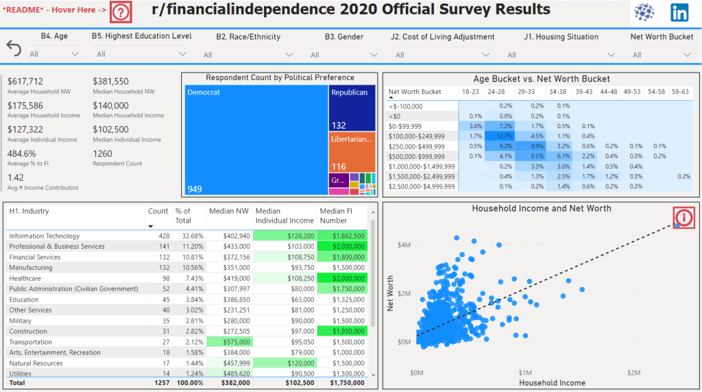
Because there are so many attributes in the raw data, I thought I’d create a Power BI app for people to slice-and-dice to their heart’s content, and find refreshing ways to look at the data. Multiple follow-up posts will be available in the coming weeks. (I am in the middle of closing on my first house!) Please comment below on what you’d like to see next/what questions you have.
Without further ado, here is the dashboard components and a walkthrough on how to use the dashboard:

There’s a lot of stuff packed into this dashboard, but we can focus on two main sections: Introduction & Administrative and Visualizations
Introduction & Administrative
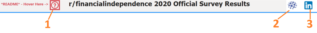
- Once you hover over the question mark, a tooltip will appear with “Quick Start” instructions.

This tooltip gives a wealth of information, such as recommending slicers (dropdowns) and showing quickly how to interact with the dashboard.
2. Link to this post (for detailed walkthrough with screenshots)
3. Wayne’s LinkedIn – Add me! I don’t bite 🙂
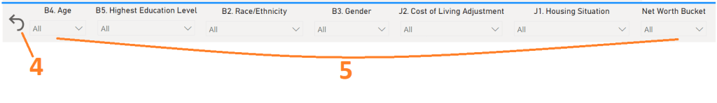
4. Reset button will reset the page (clear all filters)
5. All the slicers available!
- Age – Recommended Slicer, ~34% fell in the 24-28 age bracket & ~30% in the 29-33 age bracket
- Highest Education Level – Recommended Slicer, 1/3 of respondents had a graduate degree or higher
- Race/Ethnicity – Sometimes not enough data points, so be cognizant
- Gender – Male respondents outnumbered females ~5:1, there are not many data points for females
- Cost of Living Adjustment – Respondents were directed to Numbeo’s Cost of Living Index 2021 by City 2021 Page

This curated list of popular cities shows their cost of living index, and rating
- Housing Situation – The vast majority of respondents owns or rents their home.
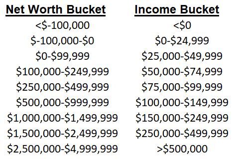
- Net Worth Bucket – Net Worth categorized into ranges
Now that we know what all these slicers are, let’s move to the visuals and how these slicers can affect the visualizations below!
Visualizations
Finally the good stuff. There are 5 visualizations on this page:
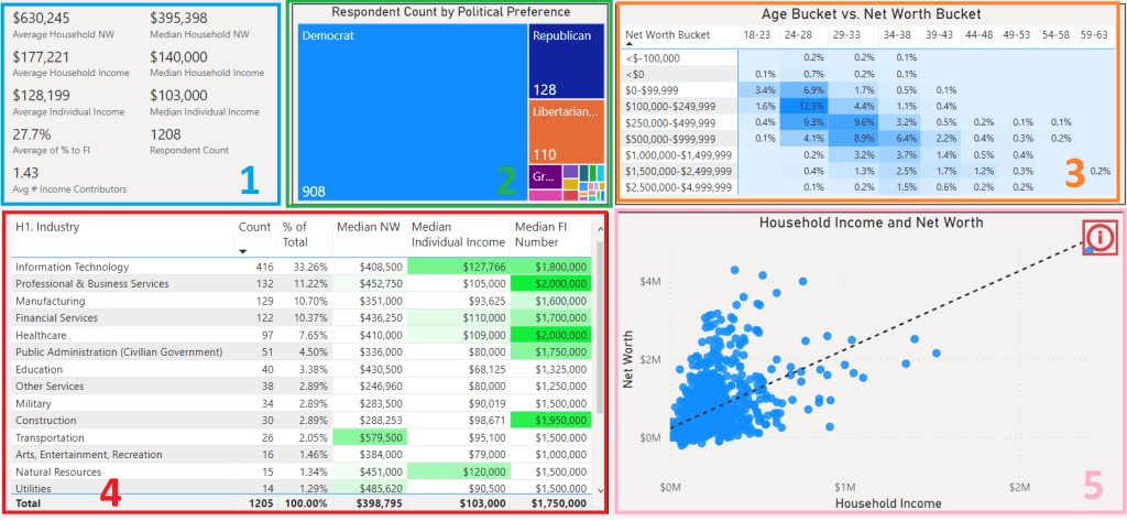
These visualizations interact with one another, so if you click “Democrat” in the treemap (green number 2), then all values will update accordingly and all further metrics will be calculated based off the 908 Democrats.
1. Average & Median Metrics
The following metrics are calculated:
- Average & Median Household Net Worth – Slice by Age, Education Level, etc. to see this metric updated
- Average & Median Household Income – Slice by Age, Education Level, etc. to see this metric updated
- Average & Median Individual Income – Slice by Age, Education Level, etc. to see this metric updated
- Average % to FI – Remember, we removed people who already achieved FI from the mix
- Respondent Count – When you select a slicer, you’ll be able to see how many respondents are now in the mix
- Avg # Income Contributors – How many individuals contribute to the household income
2. Political Preference Treemap
Clicking on a section will update the rest of the dashboard’s metrics:
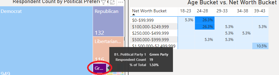
When the user clicks the “Green Party” section, which has nineteen respondents in the pool, we see the age bucket vs. net worth bucket matrix’s values update. This is true for the other four visuals in the dashboard.
3. Age Bucket vs. Net Worth Bucket
This visual looks at age bucket vs. net worth bucket. The buckets are as follows:
REMINDER: $5+ million net worth individuals have been removed from the dashboard
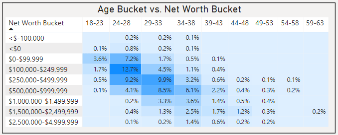
We can see here that this is a heatmap, where the darker colors represents a higher percentage falling into that age bucket and net worth bucket cross section. Let’s take this example below:

9.9% of all respondents (~125) respondents were 29-33 years old with a net worth of $250,000-$499,999. The possibilities are limitless, as you can even click the 9.9% to slice the other visualizations around them!
4. Industry Breakdown

We can see that this table gives us a wealth of information about what industry most respondents work in, along with other financial statistics. Notice that this table has been filtered to only return the median numbers and counts of 29-33 year old females holding a bachelor’s degree.
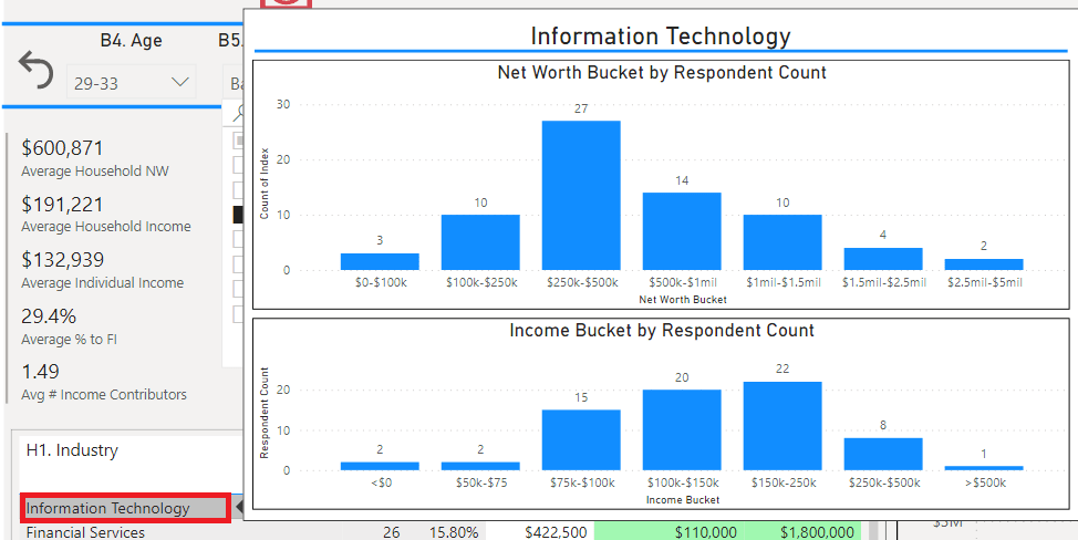
By hovering over a row (industry), you’ll see a tooltip expand. This tooltip shows the income and net worth distributions for the currently filtered data.
5. Household Income vs. Net Worth
This scatterplot shows respondents’ household income and net worth.
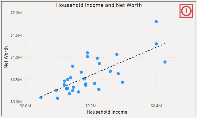
On the top right, if you hover over the “i”, you’ll see the following tooltip pop up:

NY is the “most expensive” in popular U.S. cities, whereas Phoenix returns average with Numbeo’s Cost of Living Index. As you slice the data with filters and interact with visuals, the amount of data points will change depending on demographics and filters chosen.
If you hover over a single point (filter down a little to get the pool smaller), you’ll see a tooltip pop up. The tooltip attempts to give a summary of the individual based on that respondent’s responses:

A total Assets and Liabilities analysis has been outputted, and net worth is calculated at the bottom.
Please click on the dashboard below to start:
Happy slicing!
-Wayne
