
One of the most popular functions in the statistical programming language, R, ggplot may be a little tricky to grasp at first. Let’s break down some of the different components and what they mean.
Using the classic titanic data set, we can start to build an understanding of ggplot and its components.
Once we’ve loaded the aforementioned titanic data set, we need to download and load ggplot2, which has countless other functions other than ggplot.
Setting the Stage
Install and call ggplot package:
install.packages(“ggplot2”)
library(ggplot2)
Let’s take a look at what the data looks like using the head() function:
head(titanic)

This will show the a snapshot of the first 6 rows of the data. Notice the type of data is noted under each column title. We will need to change a few of these categorical variables into factors. All this means is that we want to add “levels” to the data, so R understands that these are buckets that can describe the data.
i.e.
Pclass = 1
Pclass = 2
Pclass = 3
These numbers are not numeric, but rather attempting to bucket that individual into a certain category. They are either in Pclass = 1 (first class), Pclass = 2 (business class), or Pclass = 3 (Economy).
Let’s convert Survived, Pclass, and Sex into factors:
titanic$Survived = as.factor(titanic$Survived)
titanic$Pclass = as.factor(titanic$Pclass)
titanic$Sex = as.factor(titanic$Sex)
Now when we use the head() function, we should see a change under the columns we changed.

Perfect! To look at what levels exist for each categorical variable, we can use the unique() function:
unique(titanic$Survived)
unique(titanic$Pclass)
unique(titanic$Sex)
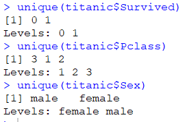
We see that they are now broken down into different levels, where Survived is either 0 or 1, Pclass is 1, 2, or 3, and Sex is either female or male.
Now let’s move on into the ggplot section!
Components of ggplot
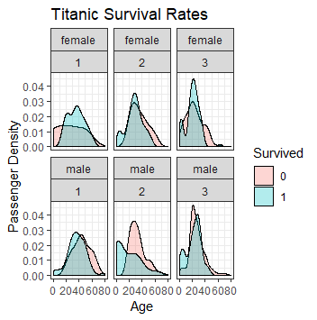
Now that we have our data in a form we can use, we can start to analyze. We can keep adding sections to the original ggplot function through ‘+’ signs. The syntax is as follows:
# Use titanic data set, and for aesthetics, use ‘Age’ as the x axis, with ‘Survived’ as the fill color.
ggplot(titanic, aes(x=Age, fill=Survived)) +# For the chart type, we want to use a density chart with an alpha of .3 (alpha just means how transparent we want the chart)
geom_density(alpha=.3) +# Choose from a variety of themes
theme_bw() +# facet_wrap means we want to know what the break the charts by, so there will be top and bottom charts by sex and side to side charts by Pclass. (Before the ‘~’ will signify vertical break, whereas after will signify a horizontal break
facet_wrap(Sex~Pclass) +# Add labels to make the chart clearer
labs(y=’Passenger Density’, title=’Titanic Survival Rates’)
To bring this all together, here is the code and the output:
ggplot(titanic, aes(x=Age, fill=Survived)) +
geom_density(alpha=.3) +
theme_bw() +
facet_wrap(Sex~Pclass) +
labs(y=’Passenger Density’, title=’Titanic Survival Rates’)
Let’s take it from the top and build some visualizations from scratch:
Let’s try and look only at survival rates by sex:
First, need to specify that we’re pulling from the titanic data set.
ggplot(titanic,
Second, we need to specify that we want the x axis to be broken down by sex, with each sex broken down by Survived.
ggplot(titanic, aes(x=Sex, fill=Survived)) +
We add a ‘+’ sign at the end to signal a second component of the function. We want to specify what type of chart we want to output now! Let’s go with a bar chart:
ggplot(titanic, aes(x=Sex, fill=Survived)) +
geom_bar() +
Next, let’s add a theme to pretty it up a little:
ggplot(titanic, aes(x=Sex, fill=Survived)) +
geom_bar() +
theme_bw() +
Lastly, we want to add labels to make it more clear on what we’re looking at:
ggplot(titanic, aes(x=Sex, fill=Survived)) +
geom_bar() +
theme_bw() +
labs(y=’Passenger Count’, title=’Titanic Survival Rates’)
Now the output is as follows:

It’s clear to see that females had a much higher chance of surviving than males!
Now, using what we’ve learned earlier, can we further break this down by having 3 of the same charts (x=Sex, fill=Survived) side by side by Pclass?
Here is the desired output:

Scroll down to see the answer!

Okay, here it is:
ggplot(titanic, aes(x=Sex, fill=Survived)) +
geom_bar() +
theme_bw() +
facet_wrap(~Pclass)
labs(y=’Passenger Count’, title=’Titanic Survival Rates’)
All we did was add a facet_wrap section to the code!
Summary
Albeit not one of the most customizable functions in R, ggplot is a great starting point to try and understand and visualize your data. With so many different possibilities of charts and ways to view the data, having ggplot on your toolbelt is a must! There are so many great resources on ggplot, and I’ve only scraped the surface.
Here are a few resources that have personally helped me:
– Special shout out to Professor Jim Mentone
